My first reaction was that I found it questionable but now I think I prefer it. I certainly think the console is an improvement as we no longer have bits of typewriters and stuff making up the controls but rather levers and buttons which is nice. I’d love it if the separate controls on the left is the Fault-locator. The only thing which I'm still not sure with are the walls.
I like that the console no longer has random household objects, such as a windshielf washer fluid basin, but I hate everything else about it:
- The Star Trek panel in the background is cliched. Plus, the main console should be able to do everything. I know that Hartnell's TARDIS has some extra equipment, such as the fault locator, but I didn't like that either.
- The walls look dirty and the color scheme is bleak and dreary. It's an unpleasant, depressing space. The TARDIS should be a warm, inviting, safe place where you'd like to hang out.
- The overall (somewhat industrial) look is cliched and conventional. The designer has given us a generic, uninspired look that sci-fans have come to mindlessly expect, rather than a fresh concept that takes us by surprise. If there really was such a thing as a Time Lord, I'm confident the interior of his TARDIS would not conform to George Lucas's idea of a spaceship interior. Although I thought the previous set (series 5-7a) was a bit too busy (and should have been toned down), I loved its overall concept and layout. It looked like a wonderland, not the bridge of the Enterprise.
Steve, I'm glad you appreciated my comments. Here's a bit more elaboration:
I read the comments where Moffat stated that he wanted the interior to look less whimsical and more like a machine. Here's the problem with that statement:
The more advanaced a machine becomes, the less like a machine it looks. When any machine is first invented, it's initial design is utilitarian. The design is more about function than form. But as the machine evolves, aesthetics become more important. Form is then just as important as function in the design. Machines tend to look more simple and elegant.
For example: A 1960's era computer had all of it's tape reels, punch cards, and rows of lights and switches. Compare that to a sleek, modern Mac Book. Or think about he interior of a 1930's commerical airplane. It was cold, metallic, and industrial, with exposed bulkheads and pipes. But a modern commerical airplane is very homey and comfortable on the inside.
Prior to the mid-1970s, sci-fi featured a wide range of space ship interiors. Then Star Wars came along. All of it's spaceship interiors had a very industrial look , with lots of metal and exposed bulkheads. That's a fine idea, but unfortunately it's been so mimiced that it's become a tired cliche.
One exception was Star Trek: The Next Generation. For the Bridge of the new Enterprise, Gene Roddenberry eschewed the cliched industrial look and went for plush carpet, fine leather and elegant wood. It looked like the inside of a limousine, not a tank. That was great! I'm not suggesting the TARDIS interior look like a limousine, but I do wish the designer would think outside the box and come up with a non-machine look (like Matt's previous TARDIS).
I thought the look of the TARDIS was brilliant in the Christmas episode, too bad we didn't spend much time in there, I wanted to become more familiar with the new design.
I like the idea of the new TARDIS design and maybe it was executed perfectly, but I like it. The main thing I'll miss from the old design is the big lever, it kind of pulled the operation of the TARDIS together, hit random buttons and switches and pull the lever!
A thing to bear in mind about the design of the console is that it's intended to hark back to the original Hartnell prop, so there is a degree of deliberate retroactive design aethestic involved.
I liked it, having grown a tad bored with the overly-whimsical approach taken since the series was relaunched (there's actually an interesting concept design of the Eccleston/Tennant console where the console intruments looked like they were designed by the Time Lords, rather than the hodge-podge of random bits we eventually had).
You can commission me to make parts of your Eleventh Doctor Costume. Click the item title below for more information, or e-mail me direct at tennantcoat@me.com and I can answer any questions.
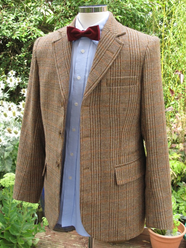
I currently hold stock of the Shetland Tweed from the original suppliers that made Matt’s Season Six jacket.
Although the original fabric is sold out, I can make a jacket from a screen-matched Donegal Tweed. This is a limited supply, so catch it while you can!
Day Of the Doctor Crafted from THE original screen-used fabric, topped off with the screen-accurate buttons. Only limited fabric is available, so message me if you want one bespoke made.
The Rings Of Akaban Also available is the Scaley silk waistcoat made with the original cloth and replica hand-made silk buttons from the original source.
Costume Indexes An episode-by-episode guide to the costume combinations worn by the Eleventh Doctor.


I actually think I prefer it.
ReplyDeleteCompared to the crazy Willy Wonka colors of the first Matt Smith console, this one is WAY more neutral. Much easier on the eyes.
It also seems to be a modern version of the classic series console room too. With simplistic layout and the circles on the wall.
Looks promising.
My first reaction was that I found it questionable but now I think I prefer it. I certainly think the console is an improvement as we no longer have bits of typewriters and stuff making up the controls but rather levers and buttons which is nice. I’d love it if the separate controls on the left is the Fault-locator. The only thing which I'm still not sure with are the walls.
ReplyDeleteI like that the console no longer has random household objects, such as a windshielf washer fluid basin, but I hate everything else about it:
ReplyDelete- The Star Trek panel in the background is cliched. Plus, the main console should be able to do everything. I know that Hartnell's TARDIS has some extra equipment, such as the fault locator, but I didn't like that either.
- The walls look dirty and the color scheme is bleak and dreary. It's an unpleasant, depressing space. The TARDIS should be a warm, inviting, safe place where you'd like to hang out.
- The overall (somewhat industrial) look is cliched and conventional. The designer has given us a generic, uninspired look that sci-fans have come to mindlessly expect, rather than a fresh concept that takes us by surprise. If there really was such a thing as a Time Lord, I'm confident the interior of his TARDIS would not conform to George Lucas's idea of a spaceship interior. Although I thought the previous set (series 5-7a) was a bit too busy (and should have been toned down), I loved its overall concept and layout. It looked like a wonderland, not the bridge of the Enterprise.
Wow - thank you for posting your comments here - whoever you are!
DeleteYou have given it a lot of thought and I really appreciate you sharing this through my blog.
Is it just me or does it look like Matt is standing in front of a Green screen?
ReplyDeleteJust you!
DeleteSteve, I'm glad you appreciated my comments. Here's a bit more elaboration:
ReplyDeleteI read the comments where Moffat stated that he wanted the interior to look less whimsical and more like a machine. Here's the problem with that statement:
The more advanaced a machine becomes, the less like a machine it looks. When any machine is first invented, it's initial design is utilitarian. The design is more about function than form. But as the machine evolves, aesthetics become more important. Form is then just as important as function in the design. Machines tend to look more simple and elegant.
For example: A 1960's era computer had all of it's tape reels, punch cards, and rows of lights and switches. Compare that to a sleek, modern Mac Book. Or think about he interior of a 1930's commerical airplane. It was cold, metallic, and industrial, with exposed bulkheads and pipes. But a modern commerical airplane is very homey and comfortable on the inside.
Prior to the mid-1970s, sci-fi featured a wide range of space ship interiors. Then Star Wars came along. All of it's spaceship interiors had a very industrial look , with lots of metal and exposed bulkheads. That's a fine idea, but unfortunately it's been so mimiced that it's become a tired cliche.
One exception was Star Trek: The Next Generation. For the Bridge of the new Enterprise, Gene Roddenberry eschewed the cliched industrial look and went for plush carpet, fine leather and elegant wood. It looked like the inside of a limousine, not a tank. That was great! I'm not suggesting the TARDIS interior look like a limousine, but I do wish the designer would think outside the box and come up with a non-machine look (like Matt's previous TARDIS).
I thought the look of the TARDIS was brilliant in the Christmas episode, too bad we didn't spend much time in there, I wanted to become more familiar with the new design.
ReplyDeleteI like the idea of the new TARDIS design and maybe it was executed perfectly, but I like it. The main thing I'll miss from the old design is the big lever, it kind of pulled the operation of the TARDIS together, hit random buttons and switches and pull the lever!
ReplyDeleteA thing to bear in mind about the design of the console is that it's intended to hark back to the original Hartnell prop, so there is a degree of deliberate retroactive design aethestic involved.
ReplyDeleteI liked it, having grown a tad bored with the overly-whimsical approach taken since the series was relaunched (there's actually an interesting concept design of the Eccleston/Tennant console where the console intruments looked like they were designed by the Time Lords, rather than the hodge-podge of random bits we eventually had).